Exploring Design Directions
08 25 2017
Moodboards might sound like a fluffy art school concept but at Fore Design, they’re an invaluable tool in our design process. They’re essential for working out a visual direction and a great opportunity to get our clients involved where it makes sense for them to contribute their knowledge and perspective: in regard to their organization’s vision, goals, and brand voice.
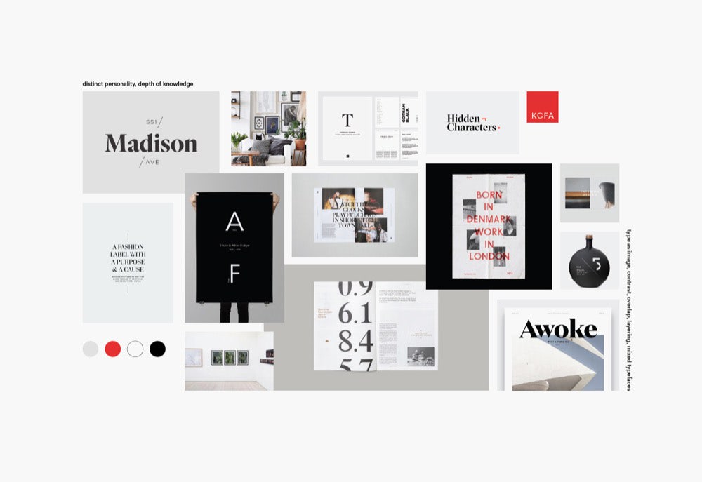
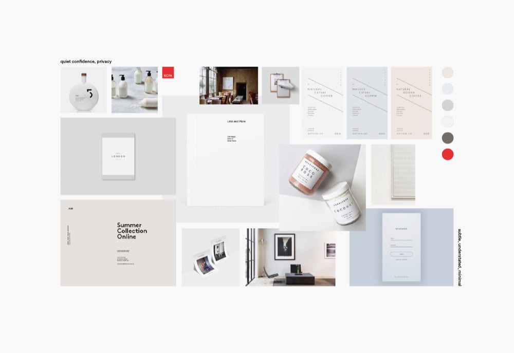
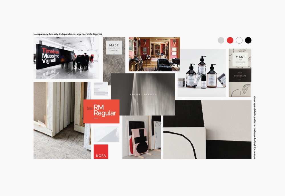
Working from the results of our Discovery phase, we figure out two or three different concepts that tie back to a project’s strategy, then start pulling color palettes, graphics, typefaces, and photography or illustration that might convey those concepts visually.
We start by creating an Illustrator file with three artboards, each the size of the paper we’ll be printing on, then crack open Dribbble, Pinterest, Instagram, BP&O, and the portfolios of some of our favorite design studios. Whatever catches our eye that fits the brief gets thrown onto one of the three boards until we feel like we’ve got enough to dig through. We’ll start sorting into logical groups, revising headings and keywords, and adding, deleting, and moving imagery until the directions start to feel visually distinct.
This part of the process is not only fun, but freeing. It allows for completely noncommittal exploration. It’s the perfect place to try out trends or styles we’ve been interested in and if it turns out they don’t work for the project, we remove them, confident that we’ve explored fully and determined that this isn’t the right time or place to use them.
If we’re lucky, some serendipitous connections will appear, unearthing some interesting concepts or ideas we hadn’t previously thought of. When that happens, we’ll rework the boards, tracking down specific images or graphics that support the new direction.
Our goal is to create three unique directions that are as different from each other as possible while still making sense for the brand. We want to explore the poles of each concept so when we review, we can pull out the elements from each board that make the most sense.
We always print these out and walk our client through them in person, laying down each board one by one and giving a quick overview of the concept and its key visual elements. We ask for first impressions as soon as everything is on the table, then go through the individual elements on each board, discussing what each might say about the organization. It’s a pretty informal setting so we pull out a Sharpie and mark up the boards with comments, cross things out, and star and circle elements we love. At this point, we’re open to mixing and matching because it’s easier to do that now than when we’re in the midst of coding a huge marketing site or laying out a 40-page book.
What this process ensures is that everyone involved understands exactly how we’ll translate key brand tenets to visual design. This is hugely important because everyone interprets words and language differently so this helps ensure everyone’s on the same page.
Sometimes a single board hits the nail on the head while other times we pull elements from two or three boards to get the look and feel just right. If that’s the case, we’ll oftentimes create a “final” moodboard so we have something to refer back to while we’re designing. We’ll tape it on the wall over our desk to make sure we (literally) don’t lose sight of what we’re working toward.
Moodboards are a great (and efficient) way to get everyone excited about and invested in the outcome of the project and ensure we don’t run into any major surprises or hiccups later on in the process.
