Fore Brand Update
12 08 2016
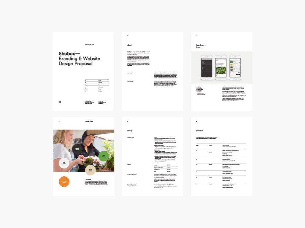
Fore Design is headed into 2017 with a more refined look. We pushed the concept of a minimal monogram a little further with this mark to make it a bit more descriptive and unique than our previous logo. We also felt like it could hold up a little better as an avatar.

Geometric Circular was the perfect complement to our new mark, so we took the opportunity to apply it to the rest of our brand materials like proposals, invoices, and social media graphics.


