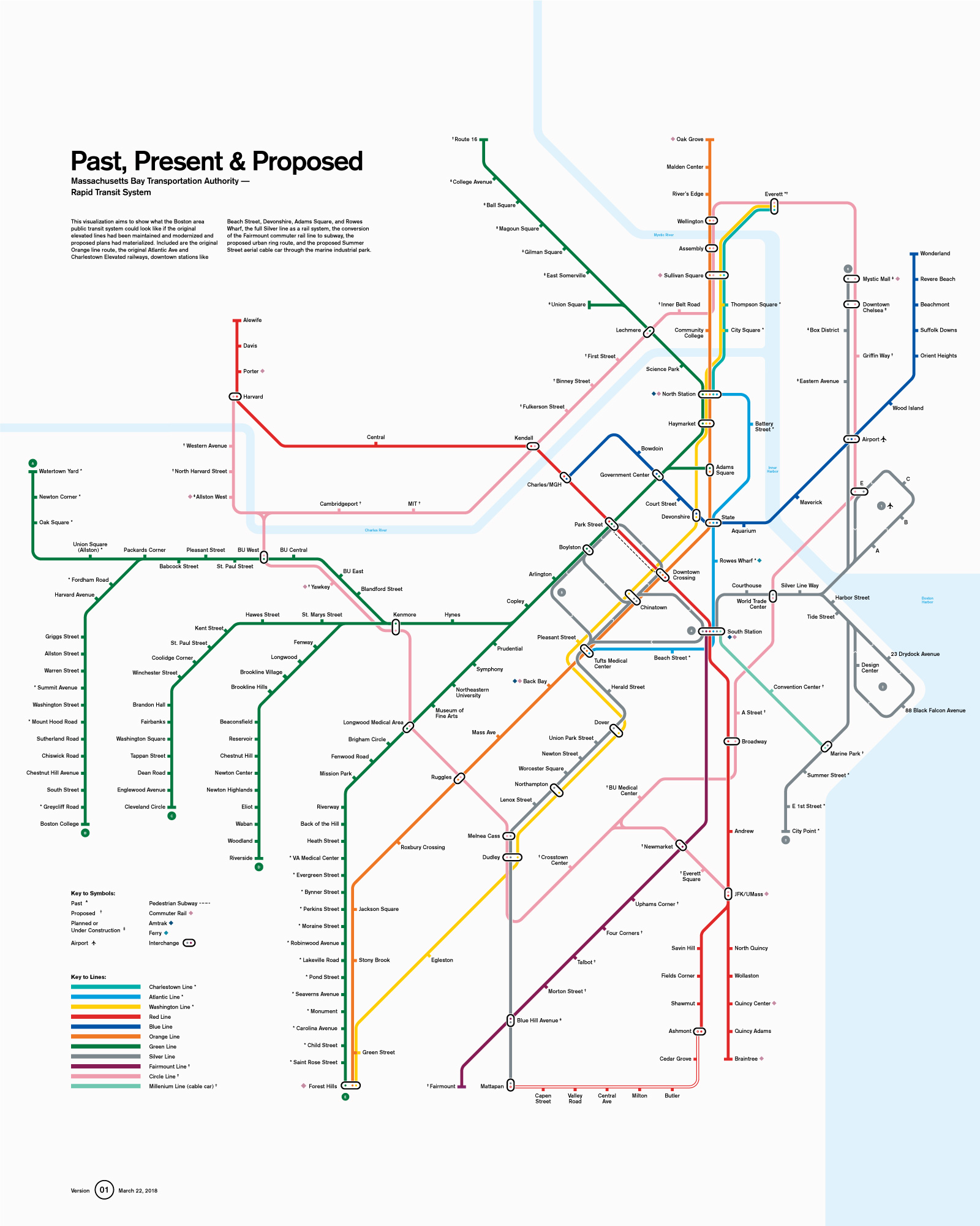
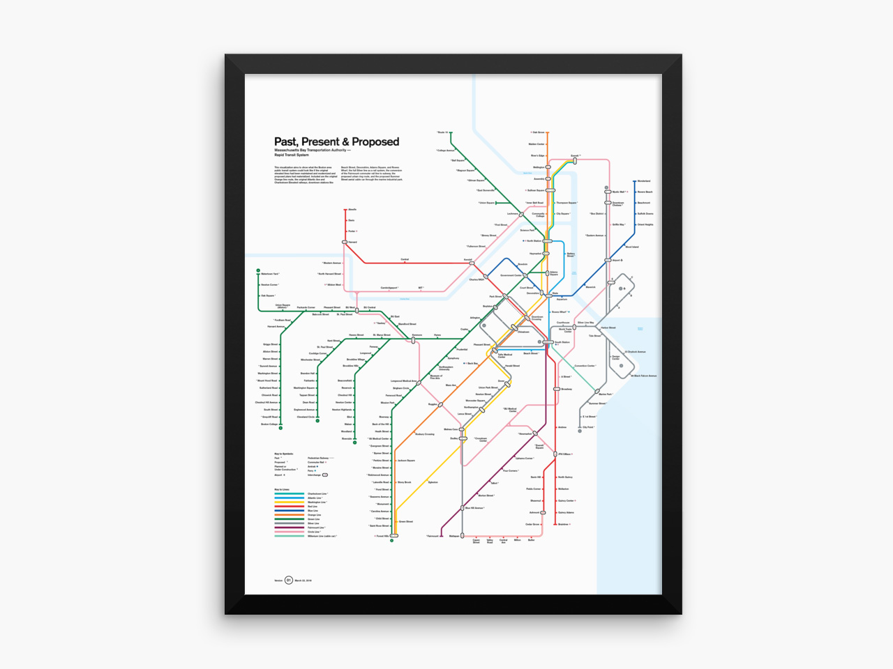
MBTA: Past, Present, and Proposed
03 22 2018
It’s no secret that we’re big fans of the London Underground. It’s clean, it’s efficient, and it’s a stunning example of a thoroughly implemented design system. It’s updated with some frequency: by the end of the year, parts of the new CrossRail / Elizabeth Line will be open, with plans already underway for CrossRail 2 and extensions to other lines.
As long as we’ve lived in Boston (and dating back much further), there hasn’t been a lot of progress on our public transit system. The Green Line extension is trudging along at a snail’s pace, plagued by constant setbacks, and it seems like every proposal (an urban ring route, commuter rail conversion) gets tabled in favor of maintenance or a bus route.
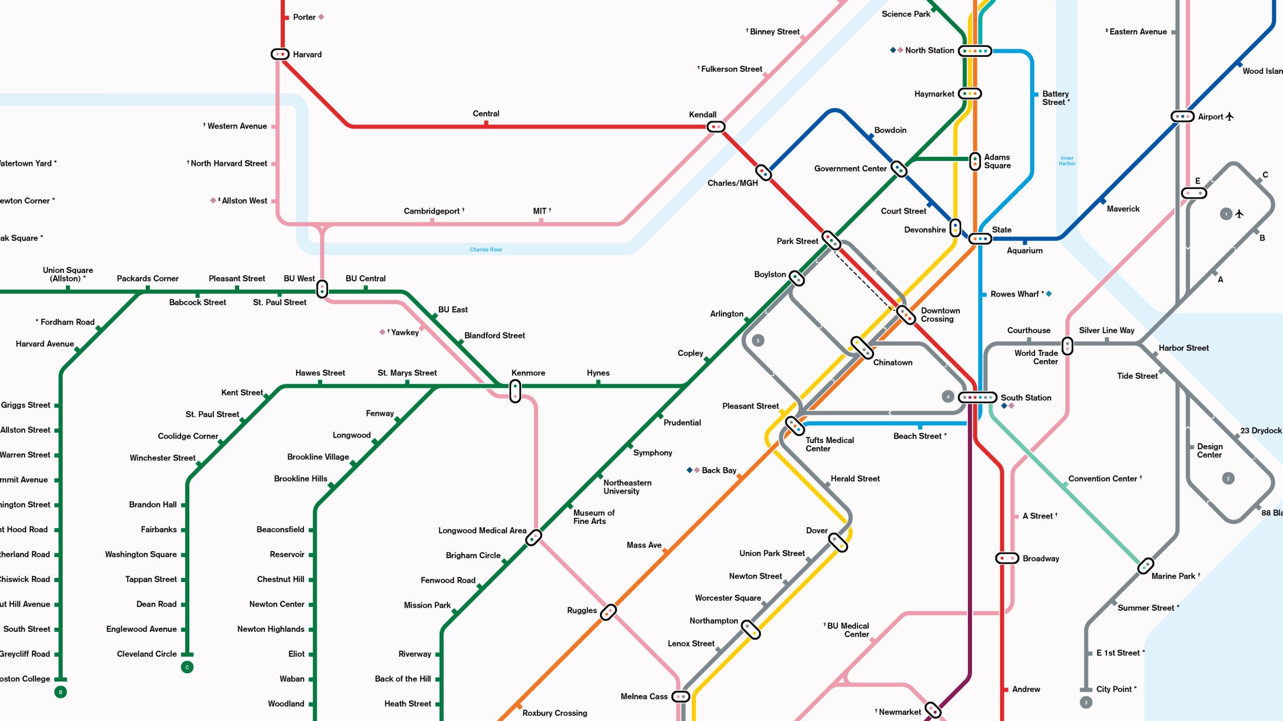
Comparing the two, we were struck by how other cities are able to consistently upgrade and update their systems and wondered what Boston’s subway might look like had the MBTA taken the same approach. What if the old elevated rail lines had been maintained and modernized and were still a part of the system? What if the Orange line had been supplemented instead of moved? What if the Silver line was actually a rail system like it was supposed to be and the Fairmount commuter rail line was converted to rapid transit? What about the A branch of the Green line?
Research
For our first version, we knew we wanted to make a schematic diagram rather than a geographically accurate map. It’s always fun to trace your route to work or your friend’s house and, for this iteration, we were more interested in understanding the expansion of the system than neighborhood coverage.
First, we dove into research, digging through as many Wikipedia articles and government planning documents as we could uncover, and compiling our findings into a spreadsheet before any drawing took place. Andrew Lynch’s animated history of the MBTA was useful in making sure we captured everything, especially as station names changed over time.
Design
While the research process continued throughout the project, we also studied up on cartography. Cameron Booth’s super-detailed account of redrawing the London Underground map was incredibly helpful for understanding how the details of a map should come together, while Jug Cerovic’s unified world metro design was great for opening up the possibilities of how a map could potentially look and work.
We started our design by tracing over the existing MBTA subway map. Lesson learned: we should have started from the (the most congested area), incorporated our additional stations, and worked out to the edges. This process meant a lot of shifting of stations and realignment of routes had to happen.
Wanting to create as clear and considered a design as possible, we compiled the best features from various maps (both real and conceptual) and tried to improve on them. Some of these elements include:
Stations
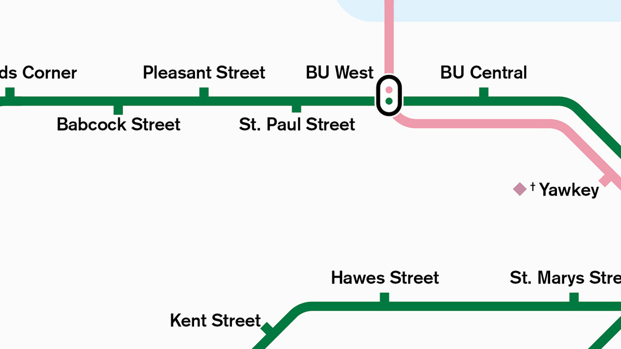
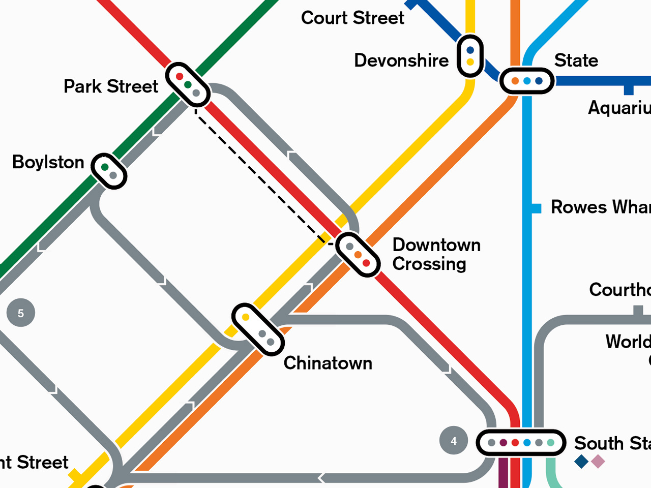
We felt that white dots inside a line (like on the existing T map and many other American subway diagrams) weren’t clear enough so we borrowed the Tube’s “nub” paradigm to point to stations. This is particularly useful to the west of BU West on the Green line where the stations are set both above and below the line in order to accommodate all of them.
Interchanges
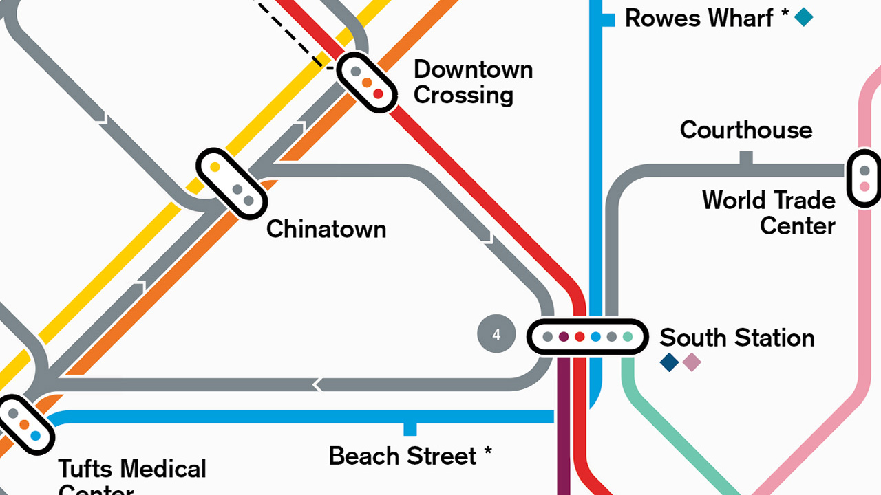
While we love the simplicity of a hollow circle to denote an interchange, it gets a little messy (and confusing) at major stations. Liverpool Street and Bank in London are good examples and, on our map, we knew North and South Station, Sullivan Square, and Dudley would be particularly complex. We landed on a hybrid of a thickly-outlined dot and a single “pill” encompassing colored dots. There’s no confusion about what lines go through the station or that you can connect between them.
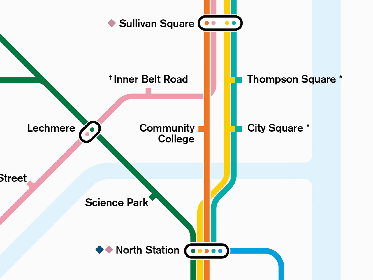
Further, we tried to route lines into complex interchanges at 90-degree angles to keep the map as clean as possible. State Street and Chinatown are good examples of this, as are North and South Stations, which we wanted to clearly visualize as hubs for the north and south sides of the city.
Grid and Spacing
To establish a unifying rhythm to the map as well as to reduce visual noise, we adhered to a few sizing and spacing principles:
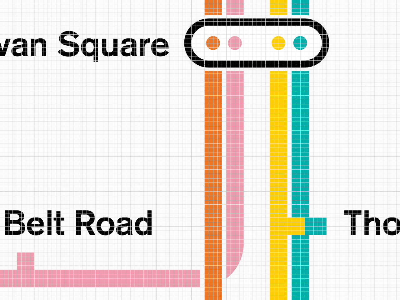
- the stroke weight of the lines equals the x-height of the labels
- the width and height of station nubs are equal to the width of the lines
- the distance between station markers and labels is consistent across the map (equal to the thickness of the lines)
- the spacing between lines as well as directional arrows and the negative space where lines overlap are all the same weight (equal to one-quarter of the thickness of the lines)
Based on the spacing mentioned above, we created grid units equal to the width of the negative space between lines. Whenever possible, lines, terminals, station nubs, and labels line up on the grid.
Land of Make-Believe
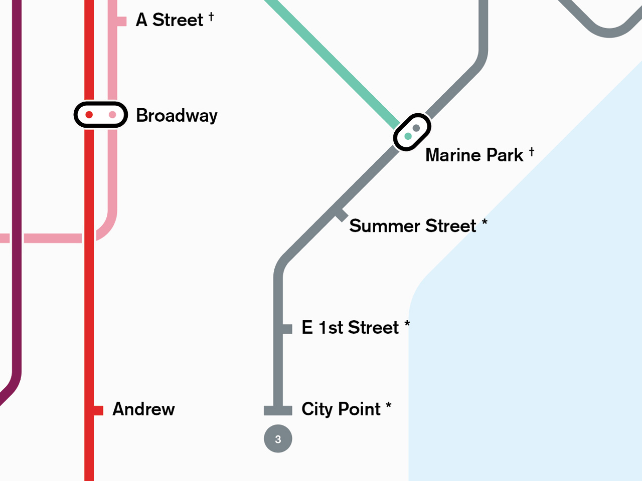
Being a composite of existing and non-existent locations, we took some liberties in imagining what a complete system might look like. Looking at a map, it seems like the old SL3 line might intersect with the end of the proposed Seaport gondola so we created an imaginary interchange at Marine Park station.
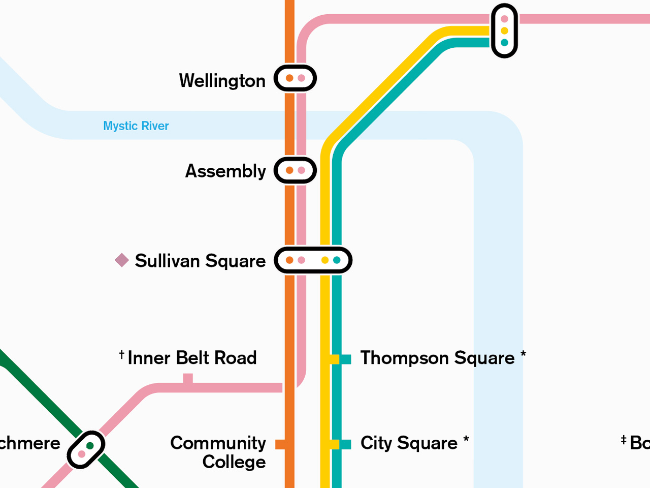
Similarly, it was a little difficult to determine exactly how the elevated railways operated so we decided it might be nice to have some redundancy in the system. We ran the original Orange line route (the yellow line on our map) on the same track as the Charlestown line to the north and alongside the new Orange line downtown.
Future Versions
It’s likely some stations are missing, labeled incorrectly, in the wrong place, or on the wrong line. (Pleasant Street in particular was difficult to place and might instead be a branch of the Green line?) If you’re a transit and/or history buff and can point us to the correct information or know of additional resources for our research, we’d love to hear from you. We fully intended to continue updating the map and exploring different ways of visualizing this unique set of data.
Poster
If you'd like to see this visualization hanging on your walls, you can purchase a print right here on our site.