Designing the KCFA Website
01 07 2018
We’re constantly evolving our process at Fore Design. In order to do that, it’s really important that we examine each part of it after every project so we can determine what works and what can be improved.
One phase that worked particularly well for us while working on a new website for Kate Chertavian Fine Art was visual design. Here’s a brief look at how it went, from kickoff meeting to launch.
Discovery
After spending a morning at Kate’s office furiously taking notes and munching on homemade scones, we heard a few key things that would inform both the strategy and the visual design of the site.
The main thing she and her team of art consultants wanted prospective clients to understand is that their job isn’t always glamorous but that they’re seasoned pros who’ll do whatever it takes to get the job done. They also wanted the site to help them attain a more even balance of private and public clients.
We also learned that, due to the nature of her client base, we wouldn’t have access to any photography for the private side of the business. Further, with major restrictions on displaying artwork for marketing or editorial purposes, we wouldn’t be able to reproduce any art unless it was shown in context or unrecognizable. For a visual art consultancy, this would be tricky!
Look and Feel
As part of our design process, we put together moodboards to get a sense of how color palettes, graphic elements, type treatments, and imagery will work together to convey a specific look and feel. As I wrote in “Exploring Design Directions,” they’re a great way to get everyone excited about and invested in the outcome of the project and ensure we don’t run into any surprises later on.
Our goal is to come up with directions that are as different from each other as possible while still making sense for the brand. We want to explore the poles of each concept so that when we review, we can pull out the elements from each board that make the most sense.
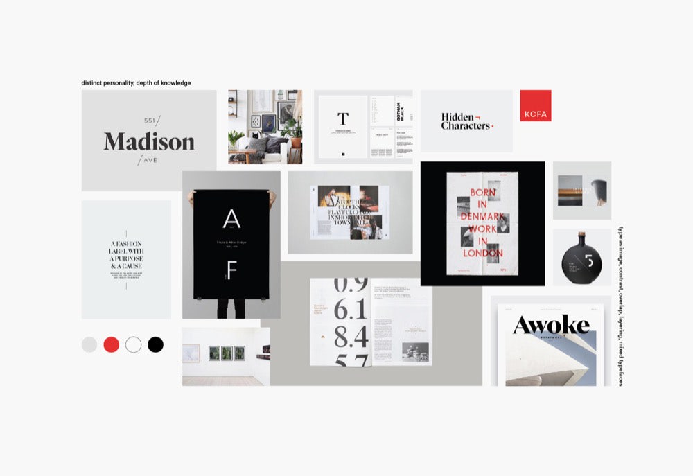
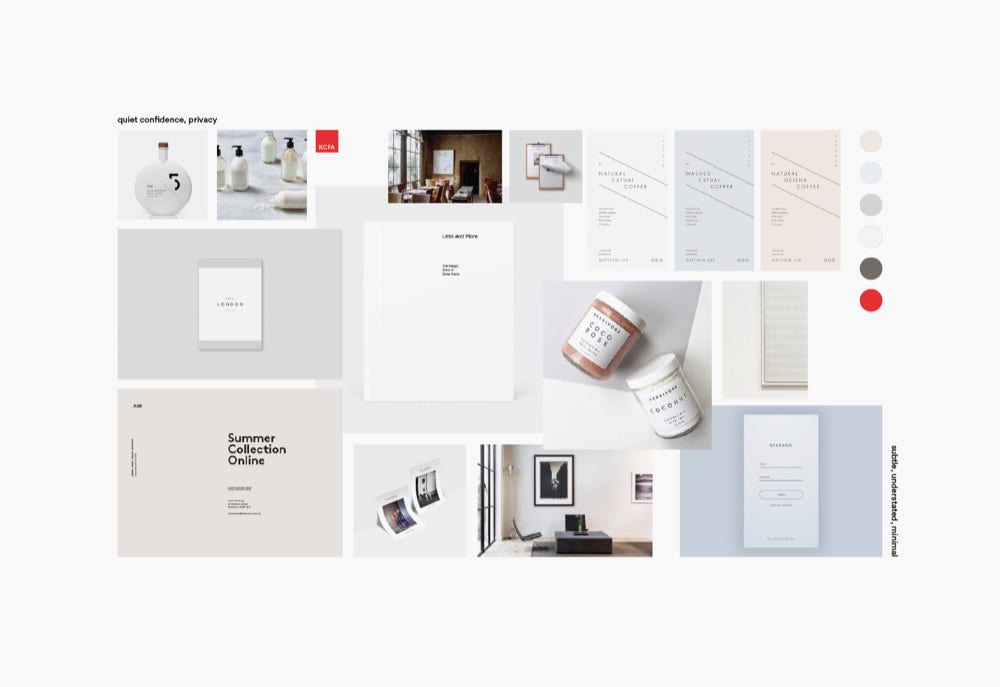
Based on our findings from the Discovery meeting, we came up with three distinct concepts to explore: depth of knowledge, privacy, and transparency.
To convey the concept of depth of knowledge, we put together a board filled with overlapping, layered elements, a mix of display, serif, and sans serif typefaces, and photos of art hanging in well-loved living spaces. This had the wonderful secondary effect of feeling a little untidy.
Moodboard number two focused on the discrete nature of Kate’s business. Subtle, understated elements and moody but simple photos of art in context reflect a quiet confidence.
Transparency and approachability were the key themes of moodboard three. A palette of medium-toned neutrals plus behind-the-scenes imagery reveal the legwork — and messiness — that’s involved in the process. Extreme closeups of paintings, drawings, and sculptures help us get around display restrictions and lend interesting color and texture to the design.
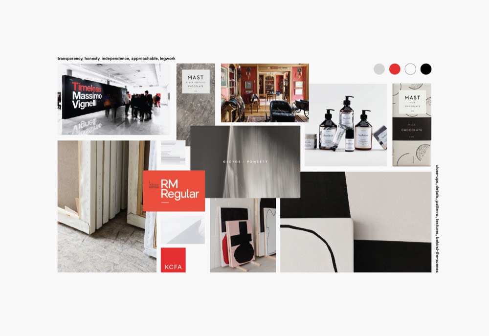
Board three was the overwhelming winner. We brightened the color palette a bit and incorporated some of the overlapping elements from board one but kept the photography strategy and type treatments in place.
Visual Design
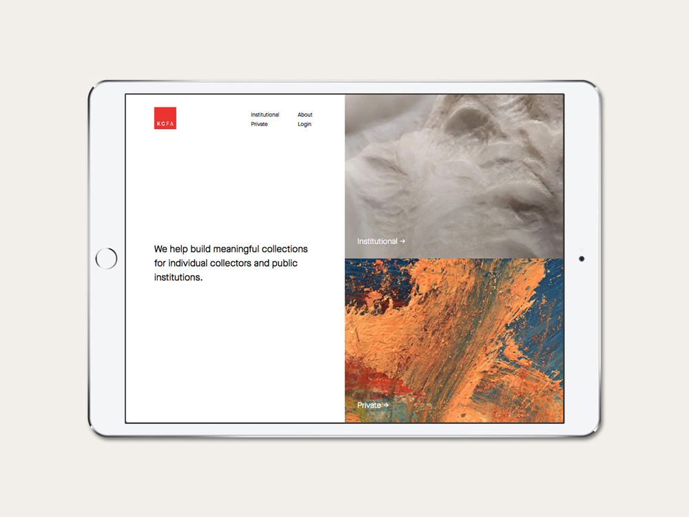
As we learned in Discovery, there’s a strong dichotomy between Kate’s private and public work — in fact, they have almost nothing to do with one another — and neither could appear more prevalent than the other. We knew right away we wanted to explore the idea of a split or a strong contrast. We also needed to incorporate a tag line or description on the home page so something as minimal as a full-screen, 50/50 split (our original vision) wouldn’t cut it.
We looked around at a few art and museum websites and whenever something with similar content structure caught our eye, Amy drew it as exactly as she could in her sketchbook. When a sketch sparked an idea, we iterated on it in as many different ways as we could think of until we had a layout that (a) worked well for the content and (b) was very different from the original inspiration.
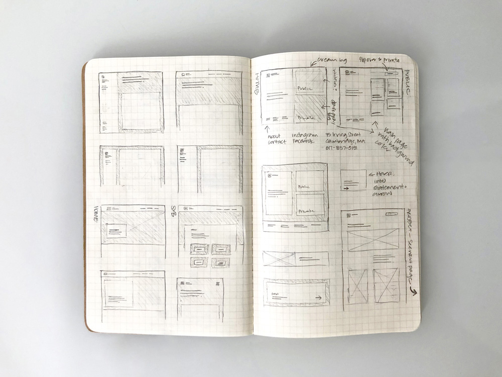
We were initially into the idea of a stark black (private) vs. white (public) contrast but, based on our moodboard discussions, we knew that would be too harsh. The idea that went into production was a split between text on the left and two detail images on the right linking to the private and public sections of the site.
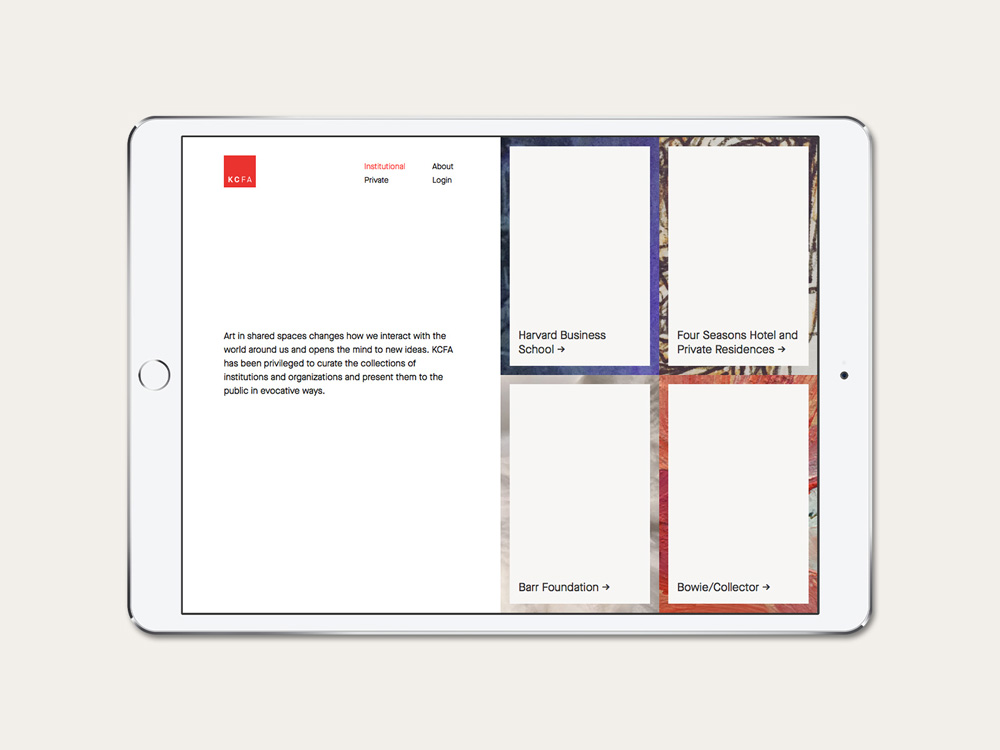
We then carried that layout idea through to the institutional landing page before diverging the layout to fit the needs of the content deeper in the site.
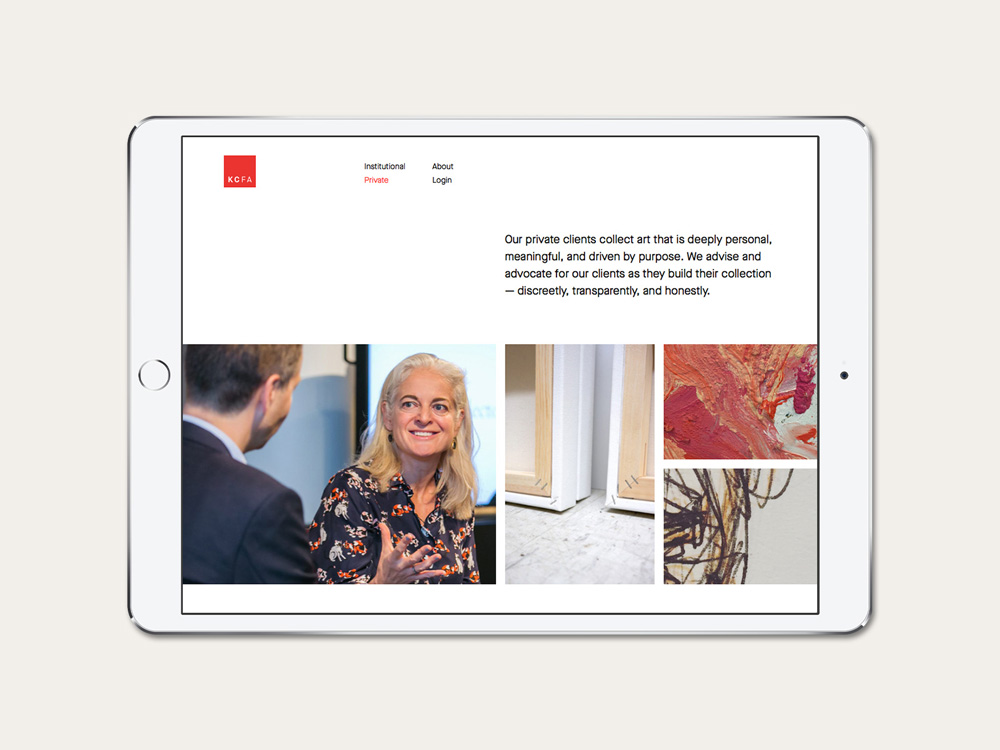
We didn’t end up incorporating any overlapping elements since the imagery itself conveyed the “messiness” we were looking for. Instead, we opted for a more structured but flexible grid that we could reuse across the site for multiple types of content.
The result was a look that Kate felt authentically represented her practice and helped deliver an outward-facing identity that perfectly matched her experience and expertise.
For more details on the full project, check out the case study or visit the site.
